
Note
Click here to download the full example code
Phase-Amplitude Coupling tutorial on sEEG data
In this example, we illustrate how to conduct a PAC analysis on real data. The data used here are taken from Combrisson et al. 2017 [5]. The task is a center-out motor task where the subject have to reach a target on a screen with the mouse. A single trial consists in three periods :
From [-1000, 0]ms it is the baseline period (REST)
From [0, 1500]ms the subject have to prepare the movement (MOTOR PLANNING period)
From [1500, 3000]ms the subject perform the movement to reach the target on the screen (MOTOR EXECUTION period)
The recorded electrophysiological data comes from an epileptic subject with electrodes deep inside the brain (intracranial EEG or stereoelectroencephalography). Here, the provided data contains only a single recording contact for one subject. This contact is located in the premotor cortex.
When working with phase-amplitude coupling, there are basically three questions you should try to answer :
What is the range of phase frequencies supporting this coupling?
Where in time this coupling occurs?
What is the range of amplitude frequencies supporting this coupling?
In this tutorial we propose to answer to those three questions using following structure :
Compute the inter-trial coherence (ITC) and see if the phases are realigned at a given time point (
tensorpac.utils.ITC)Compute the Power Spectrum Density (PSD) to try to find the phase frequency range (
tensorpac.utils.PSD)Compute the Event-Related PAC (ERPAC) to have a first idea of where the coupling occurs in time, especially if it start at a given time point (
tensorpac.EventRelatedPac)Realign time-frequency representations based on the starting time-point found with the ERPAC and see if the gamma burst follow the rhythm imposed by a phase. This step should also gives and idea of the amplitude frequency range (
tensorpac.utils.PeakLockedTF)Compute the comodulogram and statistics in order to test if the hypothetic coupling can be considered as statistically different from PAC that could be obtained by chance (
tensorpac.Pac)Preferred-phase identification (
tensorpac.utils.BinAmplitudeandtensorpac.PreferredPhase)
import os
import urllib

import numpy as np
from scipy.io import loadmat

from tensorpac import Pac, EventRelatedPac, PreferredPhase
from tensorpac.utils import PeakLockedTF, PSD, ITC, BinAmplitude

import matplotlib.pyplot as plt
Download the data
Lets first start by downloading the data. The file should be relatively small to download (1.18M). The file is going to be saved in the same folder where this script is launched. The data are downloaded only if the file is not present in the current folder
filename = os.path.join(os.getcwd(), 'seeg_data_pac.npz')
if not os.path.isfile(filename):
    print('Downloading the data')
    url = "https://www.dropbox.com/s/dn51xh7nyyttf33/seeg_data_pac.npz?dl=1"
    urllib.request.urlretrieve(url, filename=filename)

arch = np.load(filename)
data = arch['data']       # data of a single sEEG contact
sf = float(arch['sf'])    # sampling frequency
times = arch['times']     # time vector

print(f"DATA: (n_trials, n_times)={data.shape}; SAMPLING FREQUENCY={sf}Hz; "
      f"TIME VECTOR: n_times={len(times)}")
Out:
Downloading the data
DATA: (n_trials, n_times)=(160, 4001); SAMPLING FREQUENCY=1024.0Hz; TIME VECTOR: n_times=4001
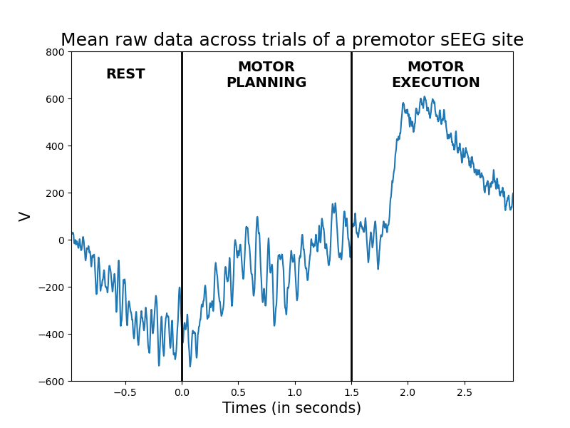
Plot the raw data
In this section, we simply plot the mean of the raw data across the 160 trials
# function for adding the sections rest / planning / execution to each figure
def add_motor_condition(y_text, fontsize=14, color='k', ax=None):
    x_times = [-.5, 0.750, 2.250]
    x_conditions = ['REST', 'MOTOR\nPLANNING', 'MOTOR\nEXECUTION']
    if ax is None: ax = plt.gca()  # noqa
    plt.sca(ax)
    plt.axvline(0., lw=2, color=color)
    plt.axvline(1.5, lw=2, color=color)
    for x_t, t_t in zip(x_times, x_conditions):
        plt.text(x_t, y_text, t_t, color=color, fontsize=fontsize, ha='center',
                 va='center', fontweight='bold')
plt.figure(figsize=(8, 6))
plt.plot(times, data.mean(0))
plt.autoscale(axis='x', tight=True)
plt.title("Mean raw data across trials of a premotor sEEG site", fontsize=18)
plt.xlabel('Times (in seconds)', fontsize=15)
plt.ylabel('V', fontsize=15)
plt.ylim(-600, 800)
add_motor_condition(700.)
plt.show()
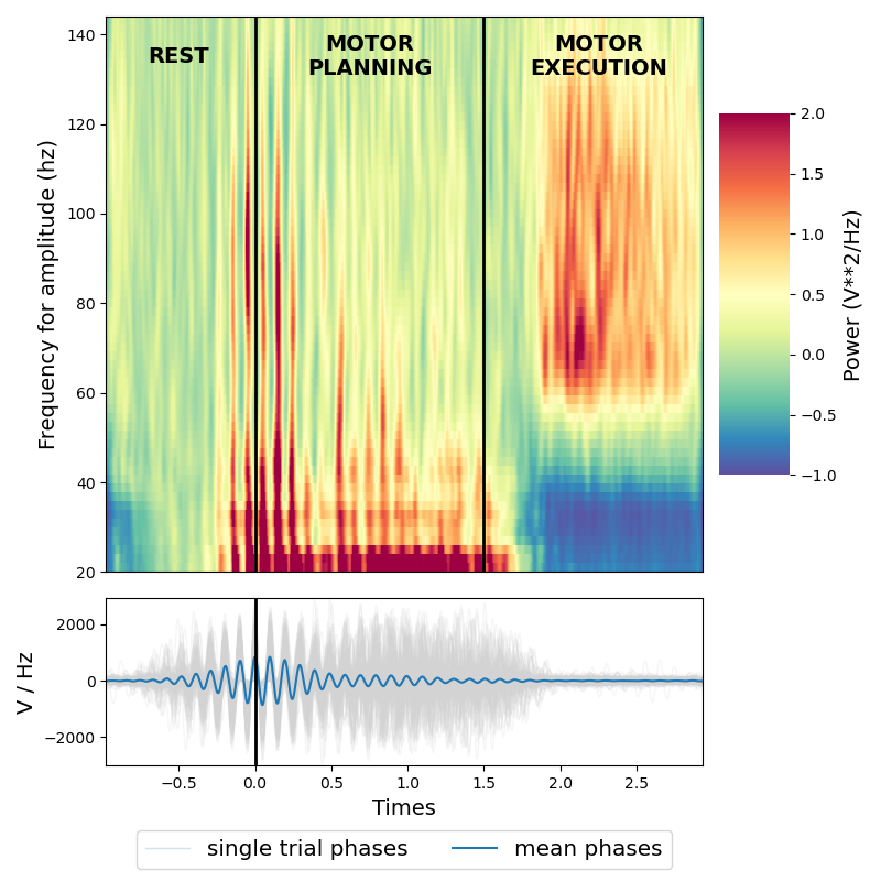
Compute and plot Inter Trial Coherence
The Inter Trial Coherence (ITC) returns a factor that indicates how much the phases are consistent across trials. Here, we compute the ITC for multiple phase frequencies
itc = ITC(data, sf, f_pha=(2, 20, 1, .2))
itc.plot(times=times, cmap='plasma', fz_labels=15, fz_title=18)
add_motor_condition(18, color='white')
plt.show()
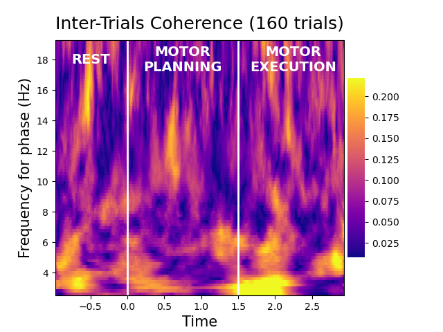
For this sEEG site, we can see that the very low frequency phase (~3Hz) are realigned at the beginning of the execution period (~1500ms)
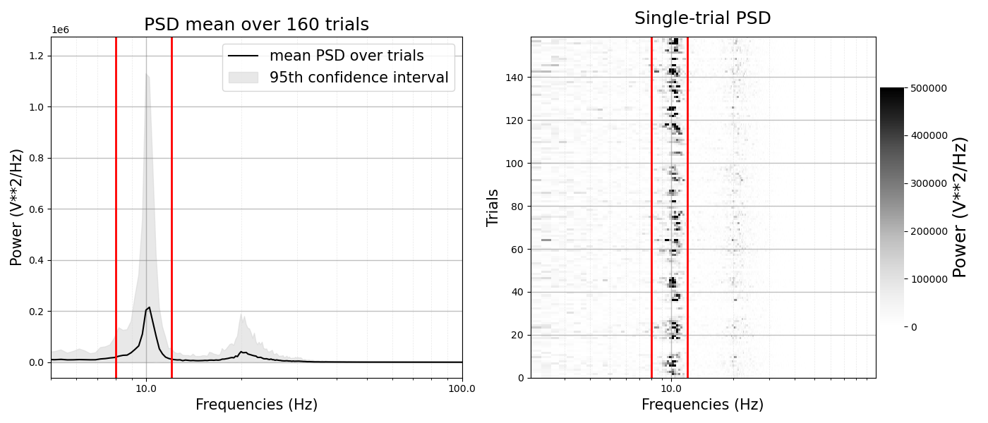
Compute and plot the Power Spectrum Density
Then, we compute the Power Spectrum Density (PSD) over all of the time-points and plot the mean PSD over the 160 trials
psd = PSD(data, sf)
plt.figure(figsize=(14, 6))
# adding the mean PSD over trials
plt.subplot(1, 2, 1)
ax = psd.plot(confidence=95, f_min=5, f_max=100, log=True, grid=True)
plt.axvline(8, lw=2, color='red')
plt.axvline(12, lw=2, color='red')
# adding the single trial PSD
plt.subplot(1, 2, 2)
psd.plot_st_psd(cmap='Greys', f_min=2, f_max=100, vmax=.5e6, vmin=0., log=True,
                grid=True)
plt.axvline(8, lw=2, color='red')
plt.axvline(12, lw=2, color='red')
plt.tight_layout()
plt.show()
Out:
/home/circleci/project/tensorpac/utils.py:208: MatplotlibDeprecationWarning: The 'basex' parameter of __init__() has been renamed 'base' since Matplotlib 3.3; support for the old name will be dropped two minor releases later.
  plt.xscale('log', basex=10)
/home/circleci/project/tensorpac/utils.py:267: MatplotlibDeprecationWarning: The 'basex' parameter of __init__() has been renamed 'base' since Matplotlib 3.3; support for the old name will be dropped two minor releases later.
  plt.xscale('log', basex=10)
From the PSD above, we can see a clear peak around 10hz that could indicate an alpha <-> gamma coupling. This peak is essentially comprised between [8, 12]Hz. This range of frequencies is then gonig to be used to see if there is indeed an alpha <-> gamma coupling (Aru et al. 2015 [1])
Compute and plot the Event-Related PAC
To go one step further we can use the Event-Related PAC (ERPAC) in order to isolate the gamma range that is coupled with the alpha phase such as when, in time, this coupling occurs. Here, we compute the ERPAC using the Gaussian-Copula mutual information (Ince et al. 2017 [6]), between the alpha [8, 12]Hz and several gamma amplitudes, at each time point.
rp_obj = EventRelatedPac(f_pha=[8, 12], f_amp=(30, 160, 30, 2))
erpac = rp_obj.filterfit(sf, data, method='gc', smooth=100)
plt.figure(figsize=(8, 6))
rp_obj.pacplot(erpac.squeeze(), times, rp_obj.yvec, xlabel='Time',
               ylabel='Amplitude frequency (Hz)',
               title='Event-Related PAC occurring for alpha phase',
               fz_labels=15, fz_title=18)
add_motor_condition(135, color='white')
plt.show()
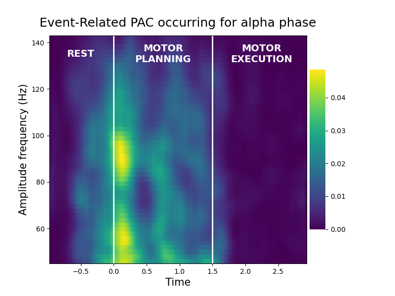
As you can see from the image above, there is an increase of alpha <-> gamma (~90Hz) coupling that is occurring especially during the planning phase (i.e between [0, 1500]ms)
Align time-frequency map based on alpha phase peak
to confirm the previous result showing a potential alpha <-> gamma coupling occuring during the planning phase, we can realign time-frequency representations (TFR) based on the alpha peak at the beginning of the planning phase (i.e at time code 0s)
peak = PeakLockedTF(data, sf, 0., times=times, f_pha=[8, 12],
                    f_amp=(5, 160, 30, 2))
plt.figure(figsize=(8, 8))
ax_1, ax_2 = peak.plot(zscore=True, baseline=(250, 750), cmap='Spectral_r',
                       vmin=-1, vmax=2)
add_motor_condition(135, color='black', ax=ax_1)
plt.tight_layout()
plt.show()
From the TFR bellow we can see the relative to baseline gamma increase such as the beta desynchronization during the execution period, which is typical for a motor site. Once realign on alpha phase, we can also see that gamma burst are regularly spaced, following the alpha rhythm, especially the gamma in [40, 120]Hz. this confirm that indeed, there is the presence of alpha <-> gamma PAC occurring during the planning phase
Compute and compare PAC that is occurring during rest, planning and execution
we now know that an alpha [8, 12]Hz <-> gamma (~90Hz) should occur specifically during the planning phase. An other way to inspect this result is to compute the PAC, across time-points, during the rest, motor planning and motor execution periods. Bellow, we first extract several phases and amplitudes, then we compute the Gaussian-Copula PAC inside the three motor periods
p_obj = Pac(idpac=(6, 0, 0), f_pha=(6, 14, 4, .2), f_amp=(60, 120, 20, 2))
# extract all of the phases and amplitudes
pha_p = p_obj.filter(sf, data, ftype='phase')
amp_p = p_obj.filter(sf, data, ftype='amplitude')
# define time indices where rest, planning and execution are defined
time_rest = slice(0, 1000)
time_prep = slice(1000, 2500)
time_exec = slice(2500, 4000)
# define phase / amplitude during rest / planning / execution
pha_rest, amp_rest = pha_p[..., time_rest], amp_p[..., time_rest]
pha_prep, amp_prep = pha_p[..., time_prep], amp_p[..., time_prep]
pha_exec, amp_exec = pha_p[..., time_exec], amp_p[..., time_exec]
# compute PAC inside rest, planning, and execution
pac_rest = p_obj.fit(pha_rest, amp_rest).mean(-1)
pac_prep = p_obj.fit(pha_prep, amp_prep).mean(-1)
pac_exec = p_obj.fit(pha_exec, amp_exec).mean(-1)
plot the comodulograms inside the rest, planning and execution period
vmax = np.max([pac_rest.max(), pac_prep.max(), pac_exec.max()])
kw = dict(vmax=vmax, vmin=.04, cmap='viridis')
plt.figure(figsize=(14, 4))
plt.subplot(131)
p_obj.comodulogram(pac_rest, title="PAC Rest [-1, 0]s", **kw)
plt.subplot(132)
p_obj.comodulogram(pac_prep, title="PAC Planning [0, 1.5]s", **kw)
plt.ylabel('')
plt.subplot(133)
p_obj.comodulogram(pac_exec, title="PAC Execution [1.5, 3]s", **kw)
plt.ylabel('')
plt.tight_layout()
plt.show()
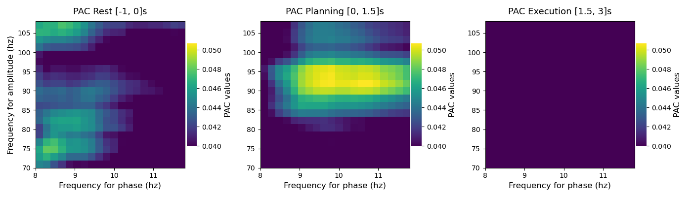
From the three comodulograms above, you can see that, during the planning period there is an alpha [8, 12]Hz <-> gamma [80, 100]Hz that is not present during the rest and execution periods
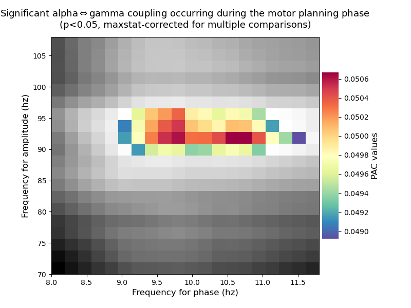
Test if the alpha-gamma PAC is significant during motor planning
finally, here, we are going to test if the peak PAC that is occurring during the planning period is significantly different for a surrogate distribution. To this end, and as recommended by Aru et al. 2015, [1] the surrogate distribution is obtained by cutting an amplitude at a random time-point and then swap the two blocks of amplitudes (Bahramisharif et al. 2013, [2]). This procedure is then repeated multiple times (e.g 200 or 1000 times) in order to obtained the distribution. Finally, the p-value is inferred by computing the proportion exceeded by the true coupling. In addition, the correction for multiple comparison is obtained using the FDR.
# still using the Gaussian-Copula PAC but this time, we also select the method
# for computing the permutations
p_obj.idpac = (6, 2, 0)
# compute pac and 200 surrogates
pac_prep = p_obj.fit(pha_p[..., time_prep], amp_p[..., time_prep], n_perm=200,
                     random_state=0)
# get the p-values
mcp = 'maxstat'
pvalues = p_obj.infer_pvalues(p=0.05, mcp=mcp)
# sphinx_gallery_thumbnail_number = 7
plt.figure(figsize=(8, 6))
title = (r"Significant alpha$\Leftrightarrow$gamma coupling occurring during "
         f"the motor planning phase\n(p<0.05, {mcp}-corrected for multiple "
          "comparisons)")
# plot the non-significant pac in gray
pac_prep_ns = pac_prep.mean(-1).copy()
pac_prep_ns[pvalues < .05] = np.nan
p_obj.comodulogram(pac_prep_ns, cmap='gray', vmin=np.nanmin(pac_prep_ns),
                   vmax=np.nanmax(pac_prep_ns), colorbar=False)
# plot the significant pac in color
pac_prep_s = pac_prep.mean(-1).copy()
pac_prep_s[pvalues >= .05] = np.nan
p_obj.comodulogram(pac_prep_s, cmap='Spectral_r', vmin=np.nanmin(pac_prep_s),
                   vmax=np.nanmax(pac_prep_s), title=title)
plt.gca().invert_yaxis()
plt.show()
Binning gamma amplitude according to alpha phase
Another sanity check of whether the amplitude is indeed modulated by the alpha phase is to bin this amplitude according to phase slices. If there’s no modulation, the bin amplitude should looks like a uniform distribution (i.e flat)
# define phase and amplitude filtering properties
kw_filt = dict(f_pha=[8, 12], f_amp=[75, 105], n_bins=20)
# bin the rest, planning and execution periods. Note that ideally, the entire
# trial should be filtered and then binning should be performed
bin_rest = BinAmplitude(data[:, time_rest], sf, **kw_filt)
bin_prep = BinAmplitude(data[:, time_prep], sf, **kw_filt)
bin_exec = BinAmplitude(data[:, time_exec], sf, **kw_filt)
now plot the binned amplitude inside the rest, planning and execution periods
plt.figure(figsize=(16, 5))
# bin rest period
plt.subplot(1, 3, 1)
bin_rest.plot(normalize=True, color='gray', unit='deg')
plt.ylim(0.5, 1.2), plt.title("REST", fontsize=18)
# bin planning period
plt.subplot(1, 3, 2)
bin_prep.plot(normalize=True, unit='deg')
plt.ylim(0.5, 1.2), plt.ylabel(''), plt.title("MOTOR PLANNING", fontsize=18)
# bin execution period
plt.subplot(1, 3, 3)
bin_exec.plot(normalize=True, color='red', unit='deg')
plt.ylim(0.5, 1.2), plt.ylabel(''), plt.title("MOTOR EXECUTION", fontsize=18)
plt.tight_layout()
plt.show()
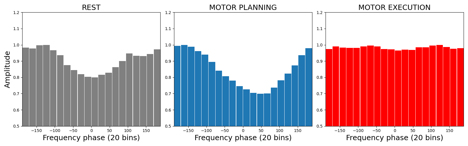
As you can see, the amplitude is modulated inside the resting and even more inside the planning phase. On the other hand, during the execution, the distribution stays flat. Note also that the amplitude is maximum arround -150° (or 210°) during the planning phase
Identify the preferred phase
The preferred phase is given by the phase bin at which the amplitude is maximum. Said differently, the gamma amplitude is binned according to the alpha phase. The preferred-phase is computed as the maximum of this histogram. To identify this preferred-phase, we propose here a polar plotting method to visualize retrieve the previous result using the histogram method
# define the preferred phase object
pp_obj = PreferredPhase(f_pha=[8, 12])
# only extract the alpha phase
pp_pha = pp_obj.filter(sf, data, ftype='phase')
pp_pha_rest = pp_pha[..., time_rest]
pp_pha_prep = pp_pha[..., time_prep]
pp_pha_exec = pp_pha[..., time_exec]
# compute the preferred phase (reuse the amplitude computed above)
ampbin_rest, _, vecbin = pp_obj.fit(pp_pha_rest, amp_rest, n_bins=72)
ampbin_prep, _, vecbin = pp_obj.fit(pp_pha_prep, amp_prep, n_bins=72)
ampbin_exec, _, vecbin = pp_obj.fit(pp_pha_exec, amp_exec, n_bins=72)
# mean binned amplitude across trials
ampbin_rest = np.squeeze(ampbin_rest).mean(-1).T
ampbin_prep = np.squeeze(ampbin_prep).mean(-1).T
ampbin_exec = np.squeeze(ampbin_exec).mean(-1).T
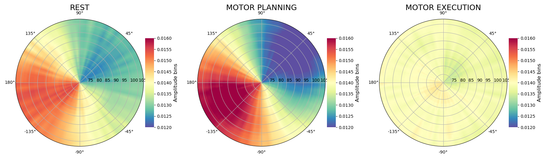
circular plot of the preferred-phase : the radius of each circle is the chosen amplitude, the angle is the phase and the maximum of the disc values (i.e the brightest color) gives the preferred-phase
plt.figure(figsize=(18, 5.2))
kw_plt = dict(cmap='Spectral_r', interp=.1, cblabel='Amplitude bins',
              vmin=0.012, vmax=0.016, colorbar=True, y=1.05, fz_title=18)
pp_obj.polar(ampbin_rest, vecbin, p_obj.yvec, subplot=131, title='REST',
             **kw_plt)
pp_obj.polar(ampbin_prep, vecbin, p_obj.yvec, subplot=132,
             title='MOTOR PLANNING', **kw_plt)
pp_obj.polar(ampbin_exec, vecbin, p_obj.yvec, subplot=133,
             title='MOTOR EXECUTION', **kw_plt)
plt.tight_layout()
plt.show()
Out:
/home/circleci/project/tensorpac/visu.py:133: MatplotlibDeprecationWarning: shading='flat' when X and Y have the same dimensions as C is deprecated since 3.3.  Either specify the corners of the quadrilaterals with X and Y, or pass shading='auto', 'nearest' or 'gouraud', or set rcParams['pcolor.shading'].  This will become an error two minor releases later.
  vmax=vmax, antialiased=True)
As you can see, we retrieve that the preferred bin alpha phase is around -150° or 210° during the rest period but even more in the planning period. While during the execution, it seems that the amplitude is not modulated by the alpha phase
Total running time of the script: ( 1 minutes 55.010 seconds)