
Note
Click here to download the full example code
Align time-frequency representations according to phase peak
This example illustrates how to realign time-frequency representations
according to a phase. In particular, a time-point of reference is first
defined (cue). Then, the closest peak phase is found around this cue and the
phase is shifted so that the peak of the phase is aligned with the cue.
Finally, the same shift is then applied to the time-frequency representation.
For an extended description, see tensorpac.utils.PeakLockedTF
This realignment can be a great tool to visualize the emergence of a phase-amplitude coupling according to a specific phase.
import numpy as np

from tensorpac.signals import pac_signals_wavelet
from tensorpac.utils import PeakLockedTF

import matplotlib.pyplot as plt
Simulate artificial coupling
first, we generate a several trials that contains a coupling between a 4z phase and a 100hz amplitude. By default, the returned dataset is organized as (n_epochs, n_times) where n_times is the number of time points and n_epochs is the number of trials
f_pha = 4.      # frequency for phase
f_amp = 100.    # frequency for amplitude
sf = 1024.      # sampling frequency
n_epochs = 40   # number of epochs
n_times = 2000  # number of time-points
x, _ = pac_signals_wavelet(sf=sf, f_pha=4, f_amp=100, noise=1.,
                           n_epochs=n_epochs, n_times=n_times)
times = np.linspace(-1, 1, n_times)
Define the peak-locking object and realign TF representations
then, we define an instance of
tensorpac.utils.PeakLockedTF. This is assessed by using a reference time-point (here we used a cue at 0 second), a single phase interval and several amplitudes
cue = 0.                 # time-point of reference (in seconds)
f_pha = [3, 5]           # single frequency phase interval
f_amp = (60, 140, 3, 1)  # amplitude frequencies
p_obj = PeakLockedTF(x, sf, cue, times=times, f_pha=f_pha, f_amp=f_amp)
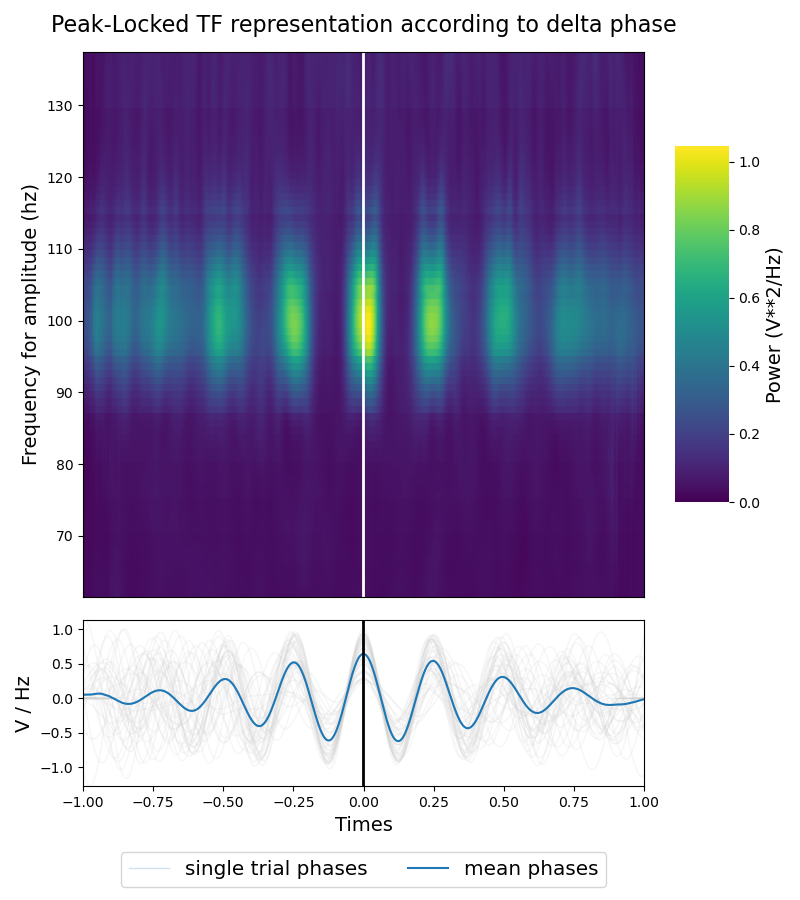
Plotting the realignment
finally, we use the integrated plotting function to visualize the result of the realignment. The returned plot contains a bottom image which is the mean of the shifted time-frequency power and a bottom line plot which contains the single trial shifted phase in gray such as the mean of those shifted phases in blue. You can see from the bottom plot that we retrieve the 4hz <-> 100hz artificial coupling
plt.figure(figsize=(8, 9))
title = 'Peak-Locked TF representation according to delta phase'
p_obj.plot(vmin=0, cmap='viridis', title=title)

# note that it is also possible to perform a z-score normalization to
# compensate the natural 1 / f effect in the power of real data. In that case
# the power is centered around 0
# p_obj.plot(zscore=True, vmin=-1, vmax=1, cmap='Spectral_r')

plt.tight_layout()
p_obj.show()
Total running time of the script: ( 0 minutes 1.215 seconds)