
Note
Click here to download the full example code
README example
Reproduced the figure in the README.
from tensorpac import Pac
from tensorpac.signals import pac_signals_tort
import matplotlib.pyplot as plt
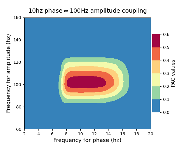
# Dataset of signals artificially coupled between 10hz and 100hz :
n_epochs = 20 # number of trials
n_times = 4000 # number of time points
sf = 512. # sampling frequency
# Create artificially coupled signals using Tort method :
data, time = pac_signals_tort(f_pha=10, f_amp=100, noise=2, n_epochs=n_epochs,
dpha=10, damp=10, sf=sf, n_times=n_times)
# Define a Pac object
p = Pac(idpac=(6, 0, 0), f_pha='hres', f_amp='hres')
# Filter the data and extract pac
xpac = p.filterfit(sf, data)
# plot your Phase-Amplitude Coupling :
p.comodulogram(xpac.mean(-1), cmap='Spectral_r', plotas='contour', ncontours=5,
title=r'10hz phase$\Leftrightarrow$100Hz amplitude coupling',
fz_title=14, fz_labels=13)
# export the figure
# plt.savefig('readme.png', bbox_inches='tight', dpi=300)
p.show()
Total running time of the script: ( 0 minutes 7.259 seconds)